Sunday, April 7, 2019

My Magazine!!

I finally finished my FEELFIT magazine! The process was a long haul. I enjoyed learning new techniques on Canva, but it really was a long project. Here are the links to the finished pages.

Magazine Front Cover
Contents
Two Page Spread


CCR and I'm Almost Finished


The CCR is available on youtube. This is where I describe my process and importance of the product. Click HERE for the link.

Two Page Spread Photo-shoot

I used my friend, Andrea Lotero, as a model for my magazine spread. These are the pictures that I gathered. Furthermore, I have pictures of the process and set design beforehand that I will include.


Click to see the finished product of Stretch or Not to Stretch

Friday, April 5, 2019

Front Cover Layout and Finishing!


INTENDED LAYOUT FOR COVER
This is the intended layout to my front cover magazine. I might change a few sub-headlines and add more, especially for the “Drop 10” one because it feels too empty with just a singular line. As of now, I was playing around with different images and colors of what was worn in them and noticed I have to avoid black at the top near the mast of the picture, but black is a nice color to wear for the model. On the other hand, white is problematic because the font color is also white. Here is an example I tried out myself.

I had the chance to go watch my friend play a soccer game during spring break and took action shot pictures of him. Here are the best ones that could potentially work for the cover.


I will try them individually now.
2nd option


1st option


I like the last one the most personally, and I think this is the front cover I will be using. Now the only thing I am missing is the CCR I need to do and the rest of the images that are still missing from the two page spread and contents page.

Thursday, April 4, 2019

Pictures Update!

Since I was alone today, I only took pictures for the Soccer Goal/Field and one for the gym that could potentially work. However, I was unable to get a picture of me taking the pictures. I will do this for others coming up.
 

I also took pictures for the month health calendar. For this I set up a plate of healthy food and kept the colors neutral so it wouldn’t be too much for the viewer’s eyes. One has the lighting intensified, while the other only works with the natural light available.

Here is how it looks inserted onto the contents page. With Canva, it is easy to rearrange images. This is the first page. 

This is the second page.


The rest of the images will be completed on Friday, as this is when I will have the ability to use another person to contribute to the portfolio. She will function as one of the models of my magazine. 

Wednesday, April 3, 2019

Photography Time

The pictures I need for the contents are as follows.
  1. (Horizontal) Fit Into Life- fitness habits, beach body
  2. (h) drop 10 lbs in 10 days- simple exercises, diet change, unwanted weight
  3. (vertical) This Month’s Health Calender- high protein and vegetable dieting
  4. (v) are fruits really good for you?
  5. (Square) france 2019 women’s world cup
  6. (h) stretch or not to stretch/ top 5 mistakes in your workout routine
  7. (h) know your way around the ropes- ins and outs of working out
The pictures needed for the two page spread are as follows.
  1. (h) stretching - after intro picture
  2. (v) long vertical of full body range of motion
  3. (h) improper technique for cons
  4. (h) prolonging stretches/susceptibility to injury/30 seconds
Ideas I have in mind for each of the 7 for contents page.
  1. Picture of people jogging in a scenic area
    1. Vista view park
    2. Hollywood Beach boardwalk
    3. Track
  2. Action picture of an exercise
    1. Plank/ab workout position
  3. Picture of plate of food
    1. (Will need to read up on food photography shots)
  4. Fruits
    1. Grocery store
    2. Bowl of fruit
  5. Soccer goal/field
    1. State finals stadium
    2. Goal net
    3. Behind/through goal net image
  6. stretch
  7. Gym
    1. Focus of using ropes
    2. Tying shoelace for sneakers
Ideas for the 4 on the two-pager.
  1. Group of people stretching
  2. T pose or long stretch with calm background
  3. Poor technique for stretch
  4. --

Overall pictures to take today:

  1. Picture of people jogging in scenic area
  2. Picture of plate of food
  3. Fruits
  4. Soccer goal
  5. gym

Tuesday, April 2, 2019

The Finished Two-Page Spread


I focused my two-page spread on “To Stretch or Not to Stretch” and did it in the format of Pros VS. Cons with a conclusion at the end of it. According to the Contents page, the article begins on page 52; therefore, I have the same page number on the first page of the spread. I began with the title in large, bold font (Archivo Black) and continued with a subheading explaining what the article will focus on and to draw attention to the readers. This is in a smaller font placed strategically below the heading. Below, the article begins and is laid out in two columns with two pictures on the first page. I used the icon of a weight instead of bullet points to add character and emphasize the genre of health and fitness. Lines and cleanness is valued for the magazine, which is why each text box, image, or graphic focuses on the margin lines and symmetry all around.


The second page of the spread continues the pros and then introduces the cons and the final concluding paragraph. I am in between changing the last paragraph and adding a space between sentences to make it two different paragraphs so it looks cleaner. This is how it would look.


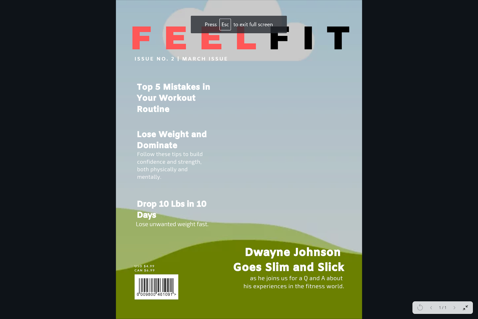
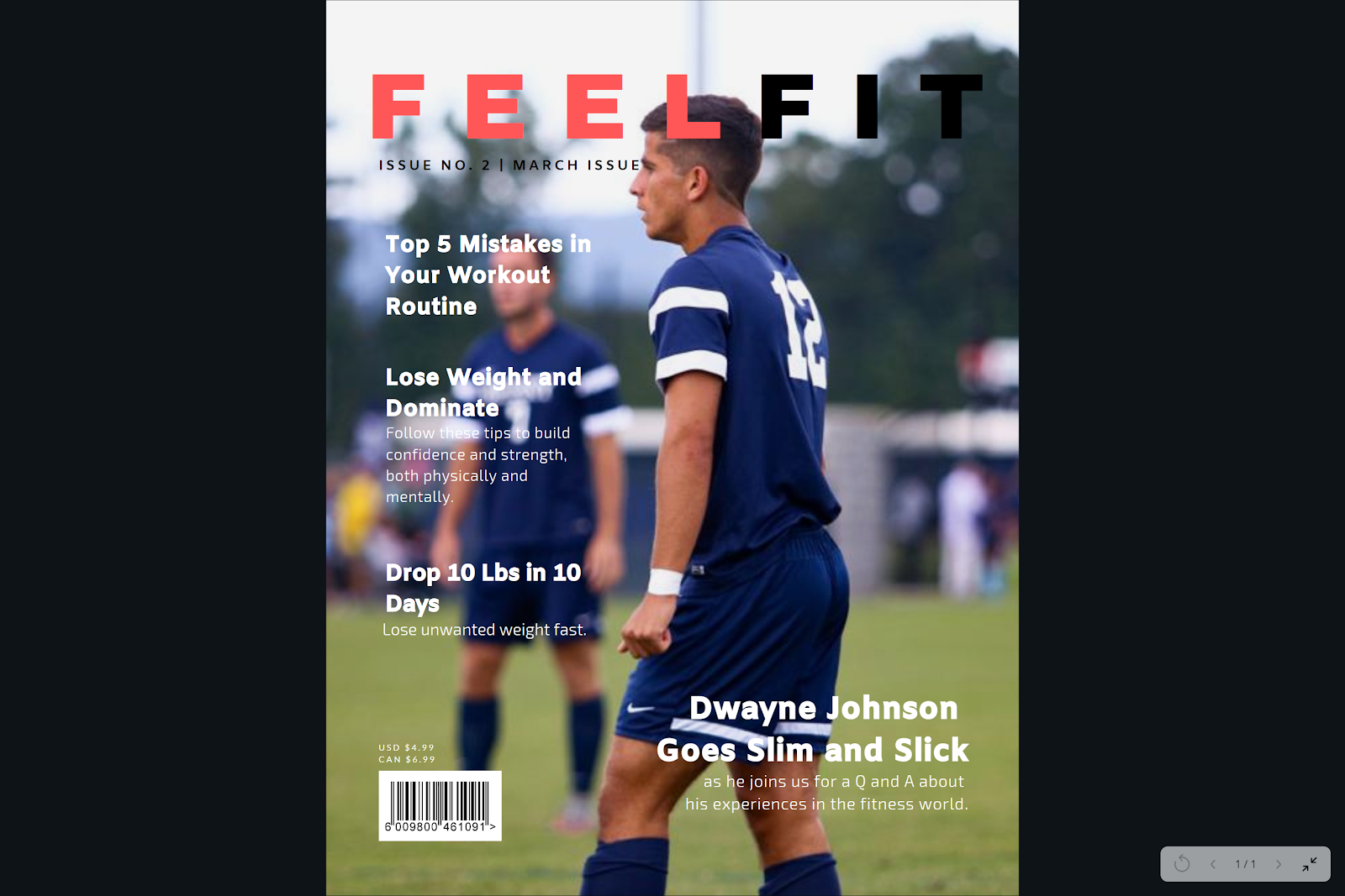
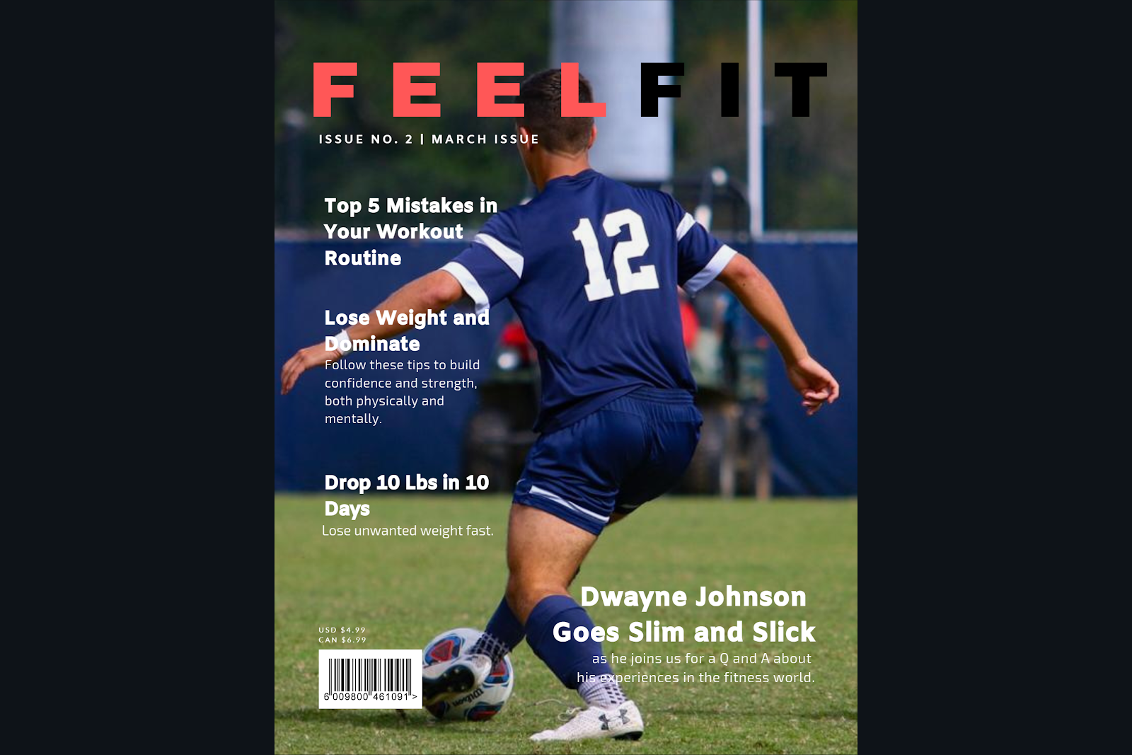
Besides that, I will work on the pictures later today for the contents page and two-pager. The front cover is going to be the easiest thing to complete; therefore, I am leaving it to the end since the cover is going to be primarily the picture and a few headlines. Not too much to the point that it will be overwhelming, keeping the theme intact.