 |
| INTENDED LAYOUT FOR COVER |
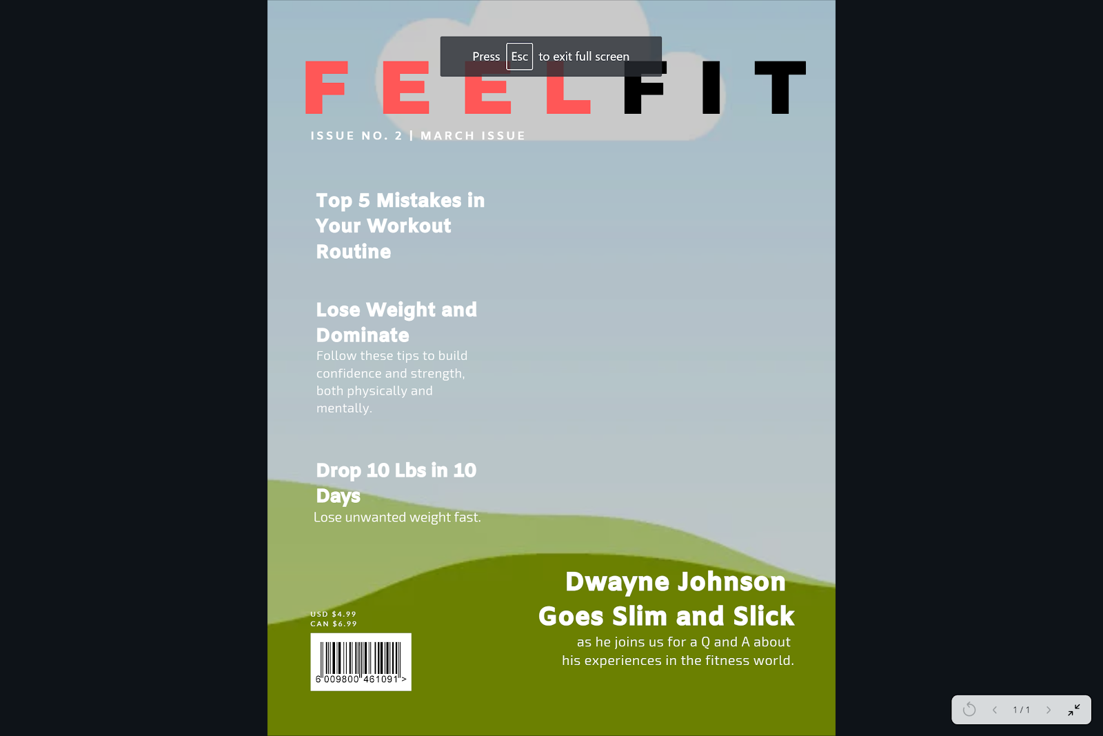
This is the intended layout to my front cover magazine. I might change a few sub-headlines and add more, especially for the “Drop 10” one because it feels too empty with just a singular line. As of now, I was playing around with different images and colors of what was worn in them and noticed I have to avoid black at the top near the mast of the picture, but black is a nice color to wear for the model. On the other hand, white is problematic because the font color is also white. Here is an example I tried out myself.
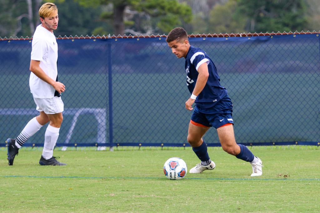
I had the chance to go watch my friend play a soccer game during spring break and took action shot pictures of him. Here are the best ones that could potentially work for the cover.


I will try them individually now.
 |
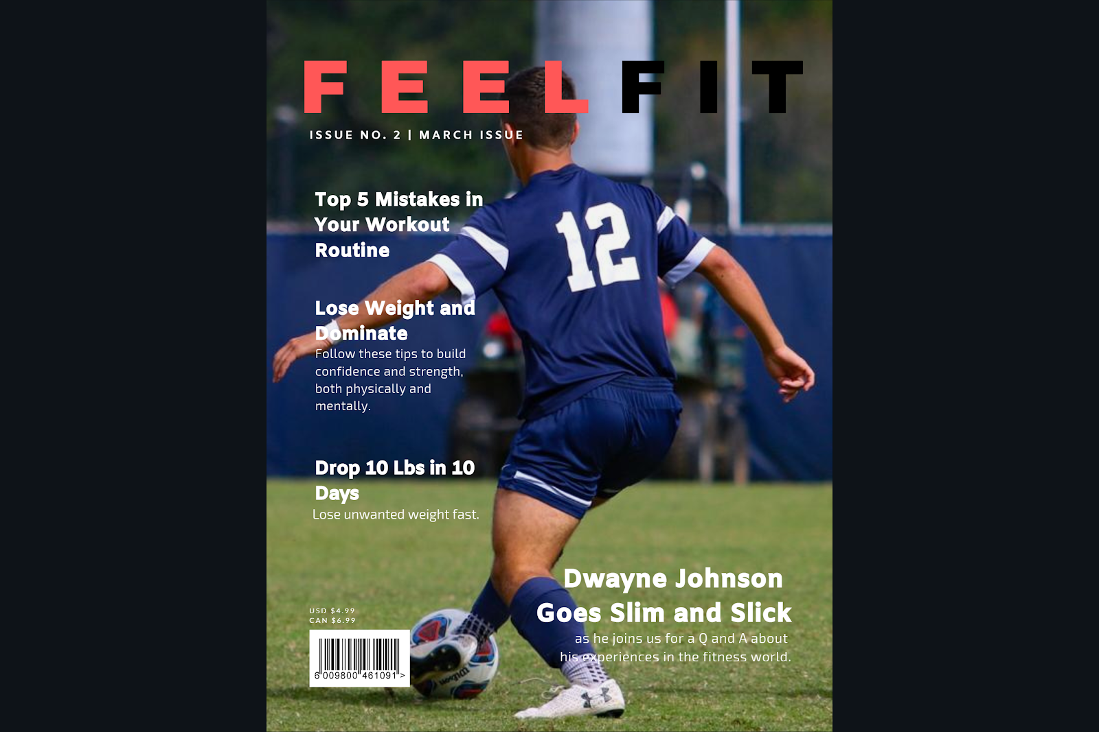
| 2nd option |
 |
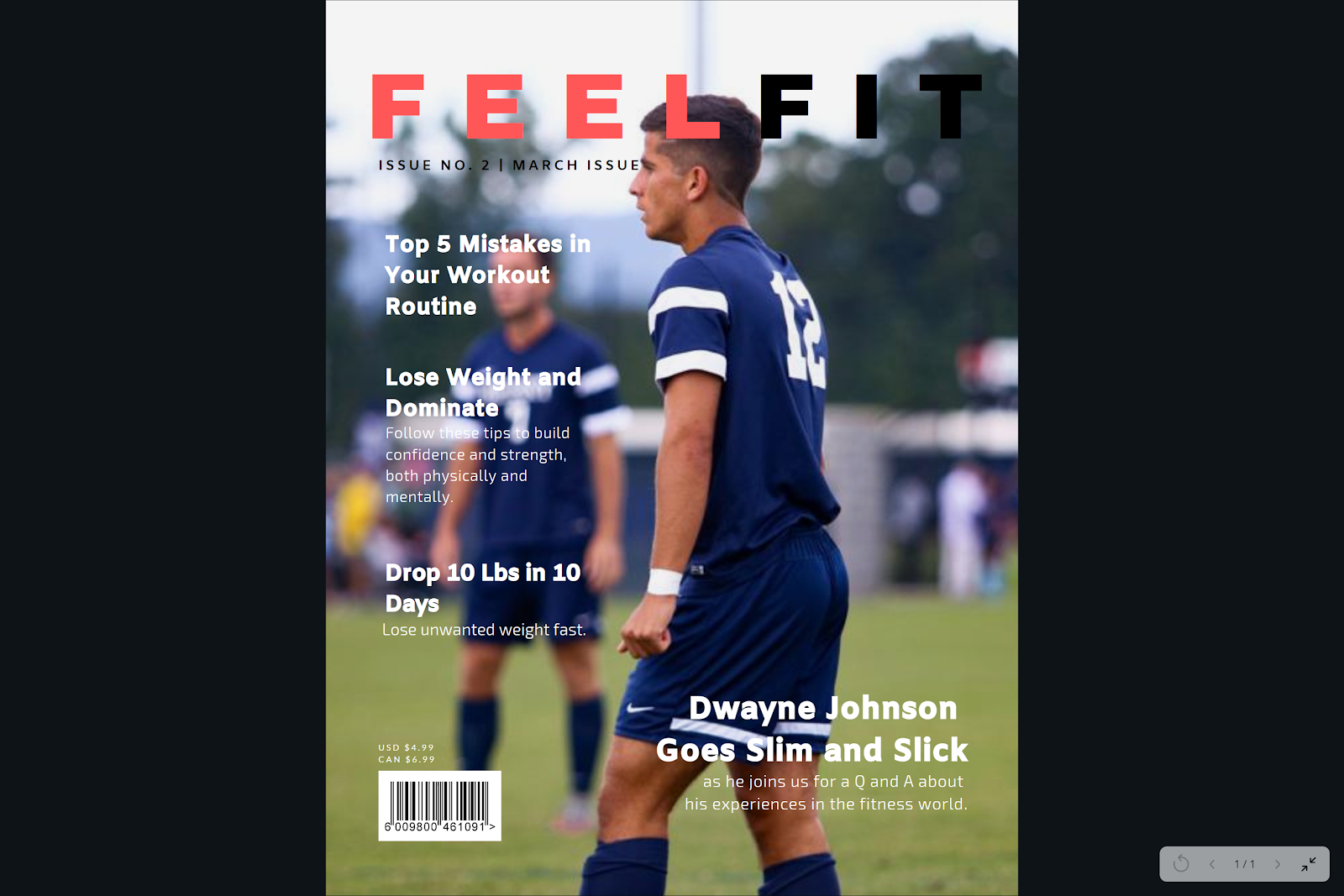
| 1st option |
I like the last one the most personally, and I think this is the front cover I will be using. Now the only thing I am missing is the CCR I need to do and the rest of the images that are still missing from the two page spread and contents page.


No comments:
Post a Comment