Doing the table of contents first has proved efficient for my project because it includes the most tedious dedication and meticulous decision making process in order to ensure everything fits the design.
I continued brainstorming the titles for the second part of the table of contents, which will include the two sections of athletics and training. In addition, it will include the editors and contributions section that references the individuals responsible for the creation process of the magazine.
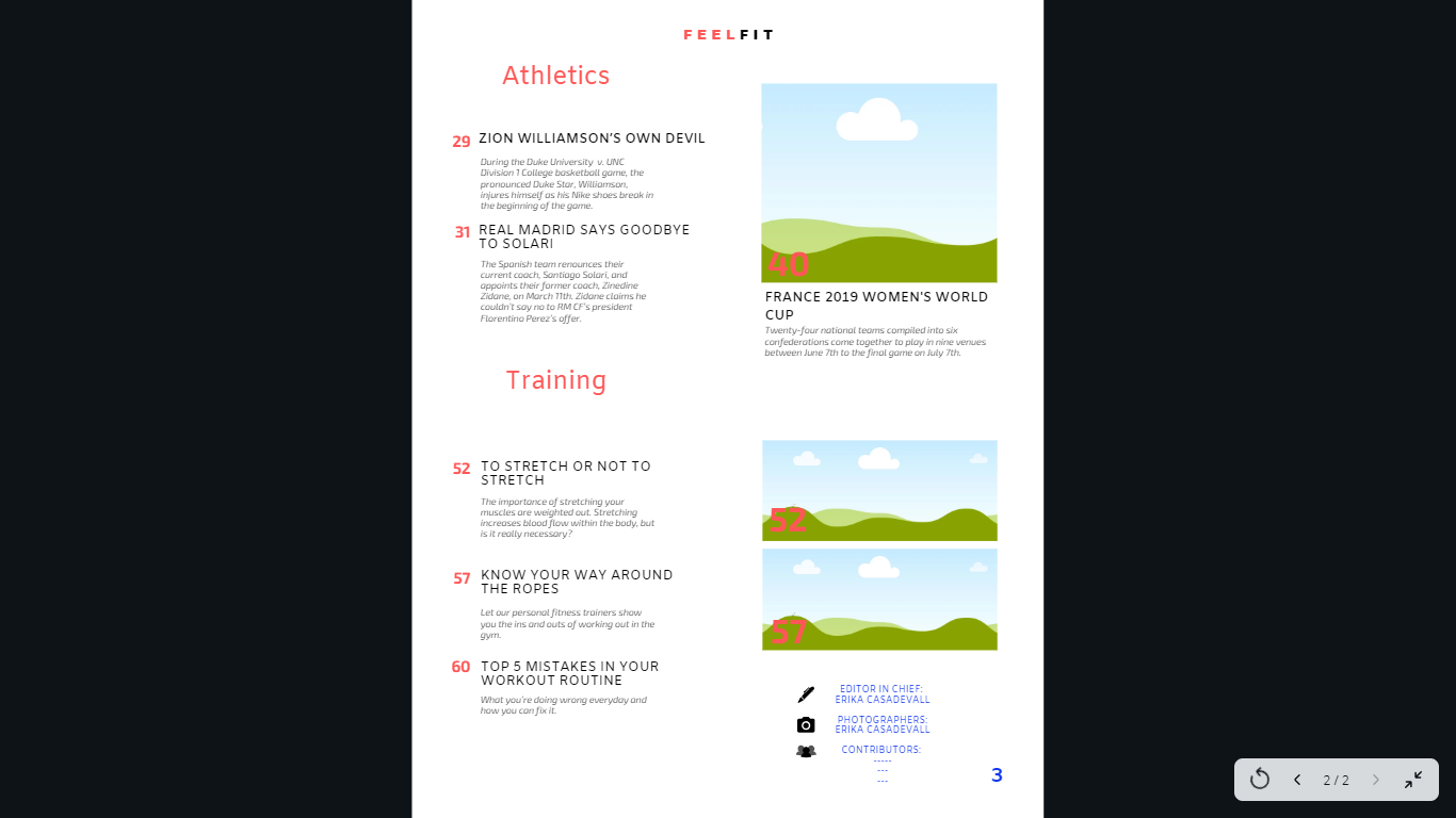
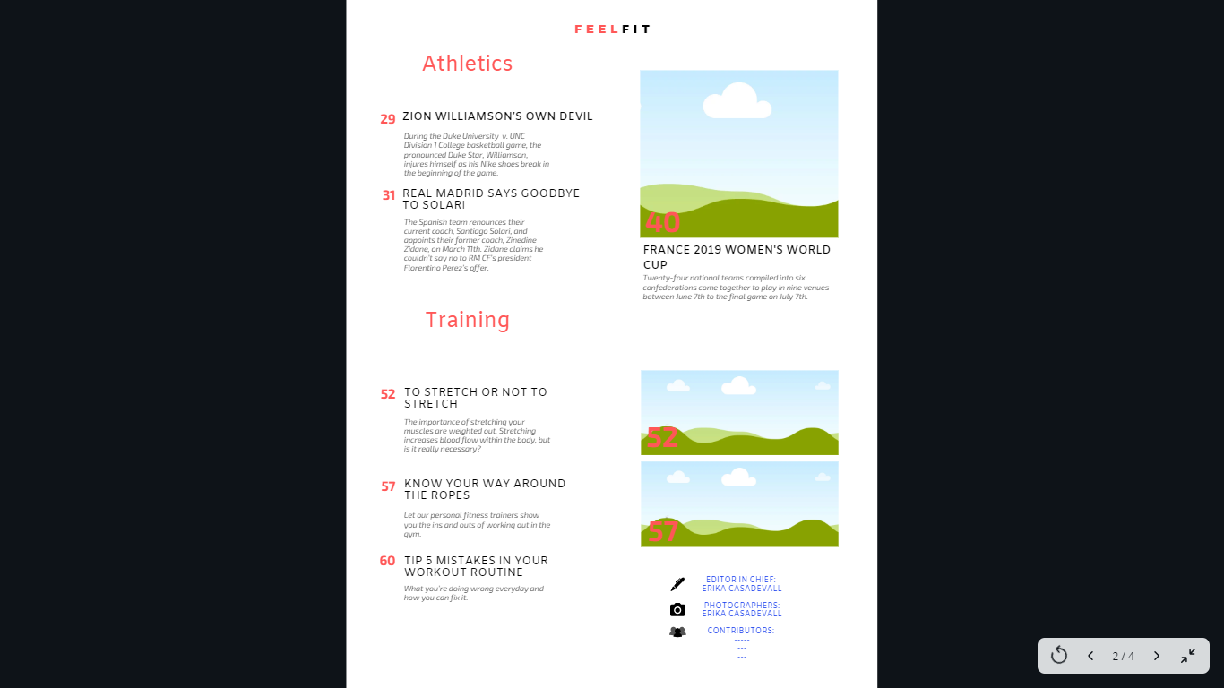
Athletics:
-Zion Williamson’s Own Devil: Nike’s
During the Duke v. UNC Division 1 College basketball game, the pronounced Duke Star, Williamson, injures himself as his Nike shoes break in the beginning of the game.
-Real Madrid Says Goodbye to Solari
The Spanish team renounces their current coach, Santiago Solari, and appoints their former coach, Zinedine Zidane, on March 11th. Zidane claims he couldn’t say no to RM CF’s president Florentino Perez’s offer.
-24 Teams Set to Compete in the France 2019 Women’s World Cup
Six confederations come together to play in 9 venues between June 7th to the final game on July 7th.
Training:
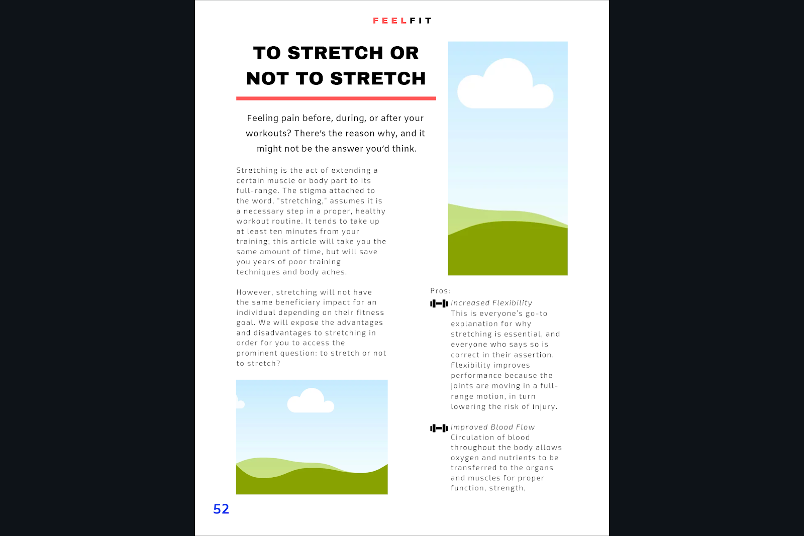
-To Stretch or Not to Stretch
The importance of stretching your muscles are weighted out. Stretching increases blood flow within the body, but is it really necessary?
-Know Your Way Around the Ropes
Let our personal fitness trainers show you the ins and outs of working out in the gym.
-How to Avoid Muscle Cramping
Follow this step-by-step process to ensure your muscles never cramp again. Feel fresh and
-Tip 5 Mistakes in Your Workout Routine
What you’re doing wrong everyday and how you can fix it.
Editors and Contributions:
-Editor: Erika Casadevall
-Photographers: Erika Casadevall
-Notable Contributions: (Those pictures in my images and places used)
I need to review magazines on my free time to see if I am missing any important information that can be included here.


 A.
A.