Thursday, February 28, 2019

Table of Contents Ideas

The table of content will be laid out between two pages side to side. Since magazines are printed text, it would be costly to print colored backgrounds on any page besides the covers. However, images will be used to cover the plain, white background to add cover and visuals to appeal to the target audience’s interest. An idea I had about the design for the table of content is to write the most important articles with their page numbers around pictures that are strategically laid out spelling “FIT.” The pictures will correlate to the stories that are next to the FIT letters.
The magazine will be in sections of topics. For example, dieting, exercising, clothing, training, etc. This will be easier for organizing the table of contents. Depending on how many articles can fit on the table of contents and look nice, the editor in chief, publisher, photographers, and contributions will be on the right side of the T in “FIT” in a single column format.

Wednesday, February 27, 2019

Cover Page Design Ideas

For the cover page of my magazine, I will include one main person who is photographed in a medium shot or long shot, demonstrating them performing a physical activity. The image will be photoshopped so the area around the individual is not included in the magazine cover, keeping the background white and simple. This parallels the stylistic design of the health and fitness genre for magazines because it targets the audience who prefer simple design rather than elaborate one.
At the mast of the magazine, the title will be displayed in a large, bold font. The colors will focus on black, white, red, and blue hues to develop the tonality of determination and focus that is symbolic in the target audience’s personal attitudes of life. Directly below the title, formatted either to the left or the right, in thinner and a lighter colored font, the date of the issue will be displayed. By making the font smaller, it keeps the focus on the title which is the important information that is being marketed. The barcode for the magazine will be put either in the bottom left or right corner of the magazine with at least half an inch of space between the border edges of the magazine. The issue date will be diagonally placed from the barcode; for example, if the issue date is placed on the top right corner, the barcode will be on the bottom left corner.

Sunday, February 24, 2019

Portfolio Project Planning

Beginning the planning of the portfolio project, I will need to focus on the specific genre of the magazine I have chosen. Genre is more distinct with in print especially in magazines. There is a heavy focus on illustrating genre characteristics to engage the target audience. Health and fitness genre is demonstrated through the specific technique and stylistic decisions that are made. For the cover page, bold and simple fonts will be used to display the headlines, sub headlines, and title of the magazine. The color choices for the letters will be black, white, and red to implement the importance of powerful articles in the magazine. Furthermore, the headlines on the cover page will be along the borders in the edges, surrounding the main figure on the page. This will be a specific celebrity/person that we choose we want to represent our magazines.

For the layout of the article, it will be very visual because the target audience gear is more towards images rather than print. For example, if the article discusses techniques on how to lose weight, images will be the main resource of the article rather than the actual description of what the story is trying to tell. The same font and colors would be displayed in the article to continue creating the brand of the magazine and reinforcing the idea of strength and power to the audience and readers.

Portfolio Project Research

For the Portfolio project, The research I started conducting was about genre that I wanted to focus my magazine on. Issues with genre concern cultural differences and audience exposure and expectations. I want to focus specifically on health and fitness genre for magazines, which has a target audience of mostly young adult males who have an age range from 18 to 26 years old and typically are from middle to high class socioeconomic status. there are no specific characters for the magazine, but we can use celebrities who have profoundly been involved with the health and fitness world.
Technical elements that will be used to gear involvement with the magazine include consumption patterns. consumption patterns describe where the magazines will be distributed in stores and how they are displayed. Subscriptions are a way of distribution for certain magazines, so the target audience needs to be studied to understand this. The stylistic approach for magazines depends on the appeal to the target audience and their unchallenging genre conventions at the beginning. for example, for health and fitness magazines artistic is not always better. Consumers like to see images of other people, which focus on certain celebrities who have made a brand for themselves within this genre, such as Dwayne Johnson.

Thursday, February 14, 2019

Music Marketing Campaign

A.

The project consisted of creating a brand for our band, Unkind Smile. They are an alternative genre band with a target audience consisting mainly of males, 18-25 years old of middle class status. We conducted research prior of our selected song that we had to make a music video for, and wrote two case studies on similar genres and artists. Then, we made a storyboard of the types of shots and angles we wanted to create for our music video (https://youtu.be/rlSmxmpaWAQ) Finally, we put together a campaign to market our band to the audience, demonstrating the strategies we would use to market and distribute our music.


B. The research was mainly on the company the actual band, Trampled by Turtles, sang the song we produced into a music video, “Wild Animals.” We discusses their history as a company, such as when they were established and certain notable moments in their history. In addition, artists under the same record label were looked at and listed to construct the two case studies, one on Trampled by Turtles’s most recent song, and the other on Mumford and Sons. It informed the target audience project choices we made, and how we planned to distribute the media to them. They followed similar trends, so we could construct our marketing strategies with the same step process in mind. For example, their website, https://www.mumfordandsons.com/, inspired the visual design of our bands website.


C. In order to market the band, we focused mainly on social media engagement with our target audience. We analyzed in our research that Mumford and Sons found success in their social media platforms as it drew in their fans and created extra buzz for their band from when they formed in 2007 to the present. For example, our twitter page and instagram page utilized the same design while having different purposes. Instagram is going to be more visual because it includes images in all their posts, so they can use it to promote new media being released to the public. Twitter would mainly focus on interaction with their fans and announcements the band may have. Their designs are similar in order to establish a brand that is easily recognized and always present in the audience’s mind.


https://twitter.com/unkindsmile2


https://www.instagram.com/unkindsmile_/?hl=en


D. From the music marketing campaign, I learned that every choice in technique, style, and design has a reason for the way it is. Whether it be certain camera shots in the music video or the font design of the band, it all has a purpose behind it in order to create brands and presence in the music industry. For example, the use of an abstract video idea lends itself to the alternative music genre and the artist’s choice to be different in their marketing techniques. For my portfolio project, meticulous choices must be made in order to convey the essence of the story in my magazine. Each decision is an important one and nothing is added without a reason.


Thursday, December 6, 2018

Representation in the Media

The group I would like to represent within my project are Immigrants. Immigrants are generally seen as foreigners who come to the United States, especially, to take the jobs from American citizens. Furthermore, individuals assume they are here on illegal status and do not deserve the same rights and opportunities.
In CBS News article called Undocumented workers say Trump golf club hired them despite their immigration status, Trump’s business supposedly hired individuals with an undocumented status in the United States and had prior knowledge to this before they were appointed for the job; additionally, the manager gave her money to get a fake green card and social security number. Here, immigrants are represented as struggling through societies difficulties. They cannot legally find a job without legal residency status in the United States, but found a contingency in order to make money to survive. They knew that assessing this issue about Trump’s unethical business practices would make them eligible to losing their jobs; however, they morally did so anyway. This represents immigrants as moral because they aim to follow the rules even when they know it is wrong.
In a news article in Cut called The Trump Administration is Still Ripping Kids From Their Families at the Border, it discusses the federal laws put in place to diminish the amount of illegal immigration in the United States throughout the Mexican border, no matter the consequence. Immigrants here are demonstrated as isolated and helpless as they cannot do anything to protect themselves since they have no legal rights in the United States. However, they come to seek refuge from the dangerous economic and political arena in Mexico. It is evident that they are ignoring legal practices, but they do so morally understanding that the risk to safety is better than the risk of staying in their little-opportunistic country.

The representation characteristics reveal the struggle and isolation that comes with migrating from one’s country of birth to another, by taking the risk of being deported back. I believe their stories of why they chose to come here are represented lightly as they are not discussed heavily in comparison to the issues they pose when they come to the United States, such as economic disparity. The representation characteristics that I would retain would be the feelings of displacement in the new country they immigrate to, as well as how this impacts society as a whole. Immigrants are viewed as dangerous simply because they are exposed to violent governments and groups single-handedly, which is unfair. Their strength to overcome these issues to leave behind their entire life for the opportunity for a new one is never mentioned. Stereotypically, they are depicted as the “problem;” however, their attempt to best adapt to the drastic lifestyle changes they are faced with is ignored.

Business Genre Post

The genre I will be choosing to explain in this blog post is the business genre. They include discussions of accounting, finance, sales, marketing, management, etc while exploring the current events of business trends around the world.The conventions of the business genre magazine include the updated discussion of global markets and finance. They usually use trends and developments to convey the most important topics to their target audience in exclusives and headlines. This further emphasizes their intended purpose to portray the study of business around the world.
Business magazines also reinforce their topics through the production techniques they display throughout the magazine. Dark colors, like navy blue, symbolize power and masculinity, which is commonly seen on covers and headlines of business magazines. The color directs the target audience to focus their intent to demonstrate unparallel perspectives on business and economic views. Their simplicity and placement of phrases on the cover are kept to a minimum because it demonstrates the sophisticated voice they project. Specific font designs are used to heighten how they are presented; the magazine company or writer has demonstrated an advanced, wordly voice so the information they share is at an educated level. Furthermore, their front covers can present a celebrity that has the high prestige that the magazine wants to embrace. They use icons to endorse their message and appeal to their target audience which leads to higher attraction to the magazine.
For example, Fortune magazine is a multinational company that discusses national business areas that distinguishes themselves from their competitors by including long, featured articles. These articles discusses accounting, finance, international business, and marketing sales that are recent current events around the world. A recent article in their November 2018 edition discusses Apple’s new discount for veterans in their store. This 10% discount in stores and online is portrayed in a long article that discusses the features on business and economy.
Another example for the business magazine genre is Forbes magazine. Forbes magazine is known for their invested articles relating to the business industry, such as marketing, advertising, sales, and management. They utilize similar production techniques of a business genre magazine for their cover page. In the August 31, 2018 issue of Forbes magazine, they feature Kylie Jenner as the celebrity on their cover page. She exemplifies the role to model for a business woman. She is dressed in a navy blazer with a blank white cover surrounding her.
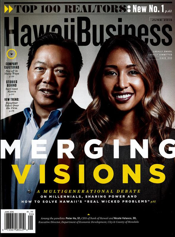
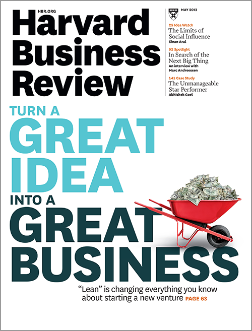
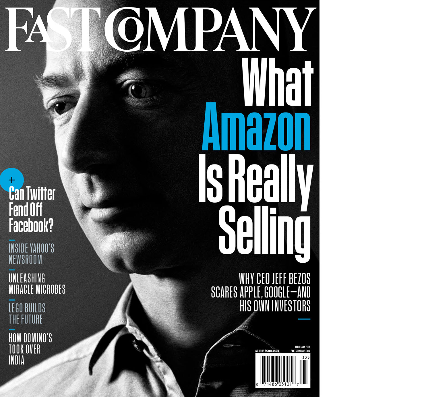
Examples of other similar magazines in the business genre are Entrepreneur, Fast Company, Harvard Business Review, Black Enterprise, and Hawaii Business.