I finally finished my FEELFIT magazine! The process was a long haul. I enjoyed learning new techniques on Canva, but it really was a long project. Here are the links to the finished pages.
Magazine Front Cover
Contents
Two Page Spread
Sunday, April 7, 2019
CCR and I'm Almost Finished
Two Page Spread Photo-shoot
I used my friend, Andrea Lotero, as a model for my magazine spread. These are the pictures that I gathered. Furthermore, I have pictures of the process and set design beforehand that I will include.
Click to see the finished product of Stretch or Not to Stretch.
Friday, April 5, 2019
Front Cover Layout and Finishing!
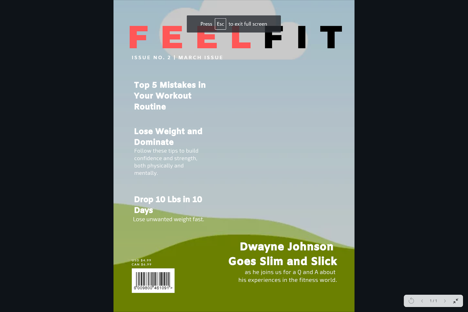
| INTENDED LAYOUT FOR COVER |

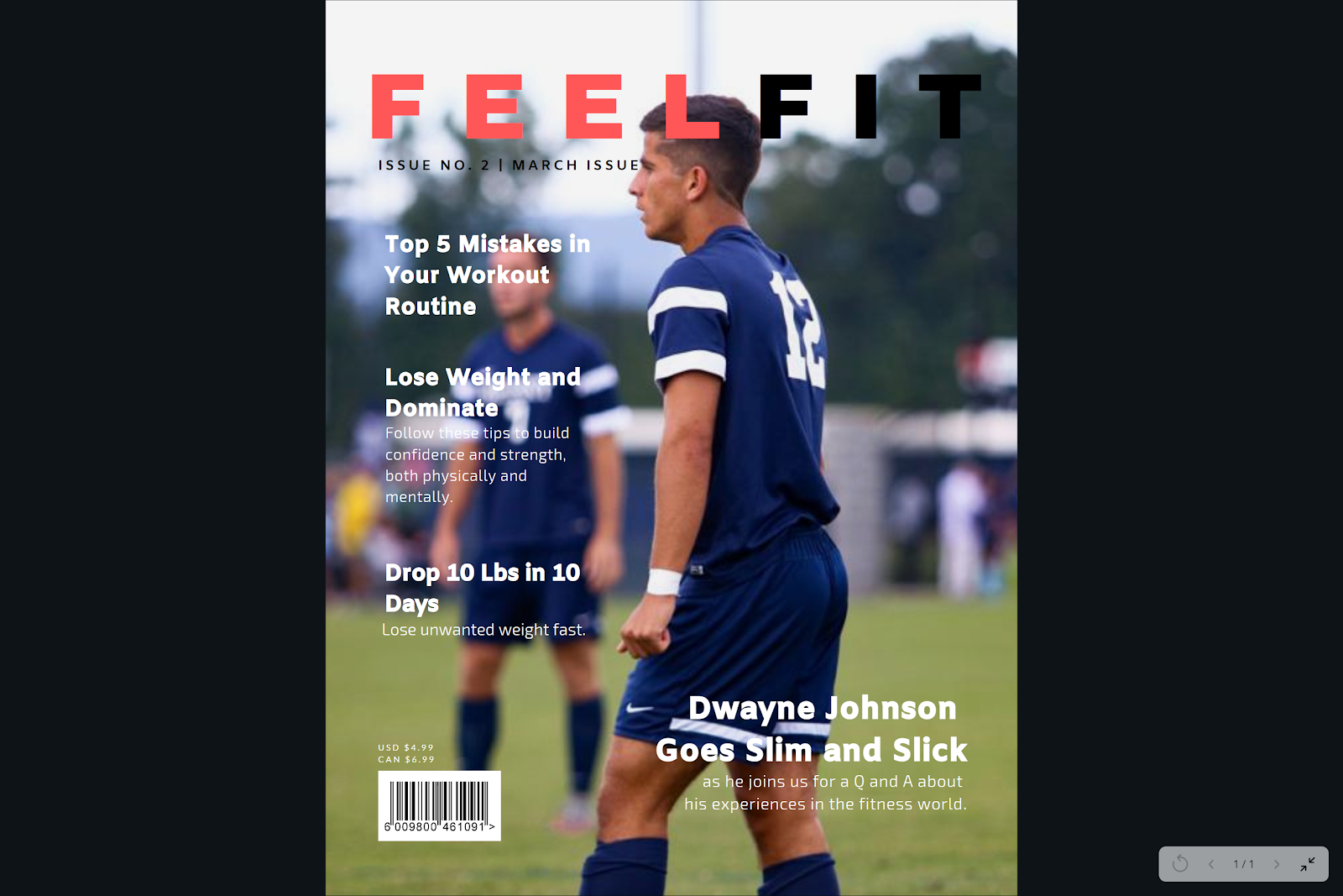
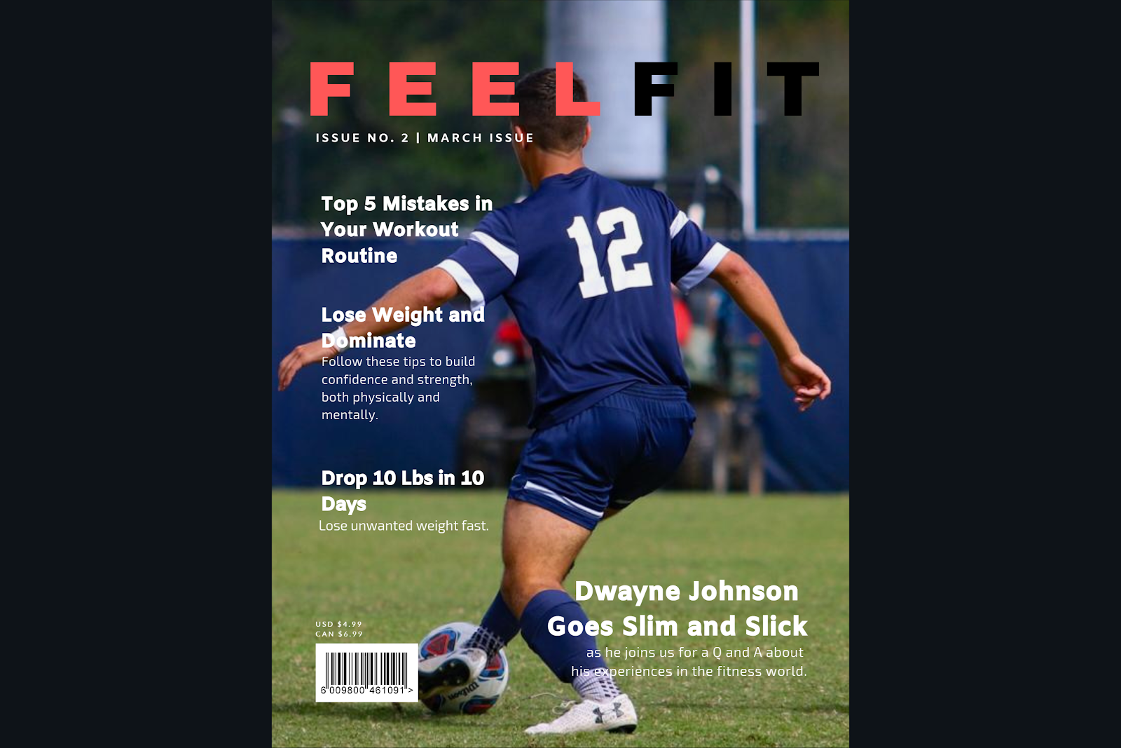
I will try them individually now.
| 2nd option |
| 1st option |
I like the last one the most personally, and I think this is the front cover I will be using. Now the only thing I am missing is the CCR I need to do and the rest of the images that are still missing from the two page spread and contents page.
Thursday, April 4, 2019
Pictures Update!
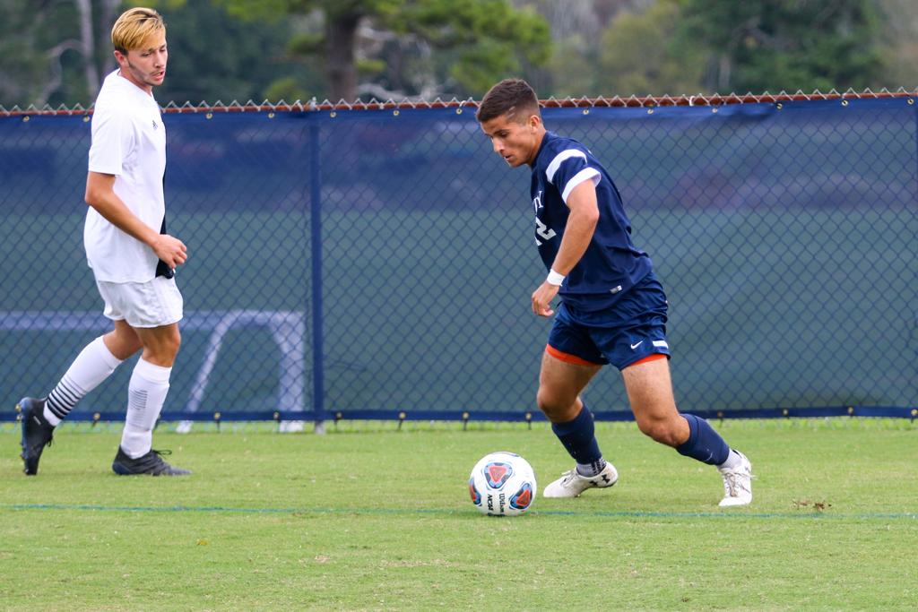
Since I was alone today, I only took pictures for the Soccer Goal/Field and one for the gym that could potentially work. However, I was unable to get a picture of me taking the pictures. I will do this for others coming up.


I also took pictures for the month health calendar. For this I set up a plate of healthy food and kept the colors neutral so it wouldn’t be too much for the viewer’s eyes. One has the lighting intensified, while the other only works with the natural light available.

The rest of the images will be completed on Friday, as this is when I will have the ability to use another person to contribute to the portfolio. She will function as one of the models of my magazine.
I also took pictures for the month health calendar. For this I set up a plate of healthy food and kept the colors neutral so it wouldn’t be too much for the viewer’s eyes. One has the lighting intensified, while the other only works with the natural light available.
| Here is how it looks inserted onto the contents page. With Canva, it is easy to rearrange images. This is the first page. |
| This is the second page. |
Wednesday, April 3, 2019
Photography Time
The pictures I need for the contents are as follows.
Overall pictures to take today:
- (Horizontal) Fit Into Life- fitness habits, beach body
- (h) drop 10 lbs in 10 days- simple exercises, diet change, unwanted weight
- (vertical) This Month’s Health Calender- high protein and vegetable dieting
- (v) are fruits really good for you?
- (Square) france 2019 women’s world cup
- (h) stretch or not to stretch/ top 5 mistakes in your workout routine
- (h) know your way around the ropes- ins and outs of working out
- (h) stretching - after intro picture
- (v) long vertical of full body range of motion
- (h) improper technique for cons
- (h) prolonging stretches/susceptibility to injury/30 seconds
- Picture of people jogging in a scenic area
- Vista view park
- Hollywood Beach boardwalk
- Track
- Action picture of an exercise
- Plank/ab workout position
- Picture of plate of food
- (Will need to read up on food photography shots)
- Fruits
- Grocery store
- Bowl of fruit
- Soccer goal/field
- State finals stadium
- Goal net
- Behind/through goal net image
- stretch
- Gym
- Focus of using ropes
- Tying shoelace for sneakers
- Group of people stretching
- T pose or long stretch with calm background
- Poor technique for stretch
- --
Overall pictures to take today:
- Picture of people jogging in scenic area
- Picture of plate of food
- Fruits
- Soccer goal
- gym
Tuesday, April 2, 2019
The Finished Two-Page Spread
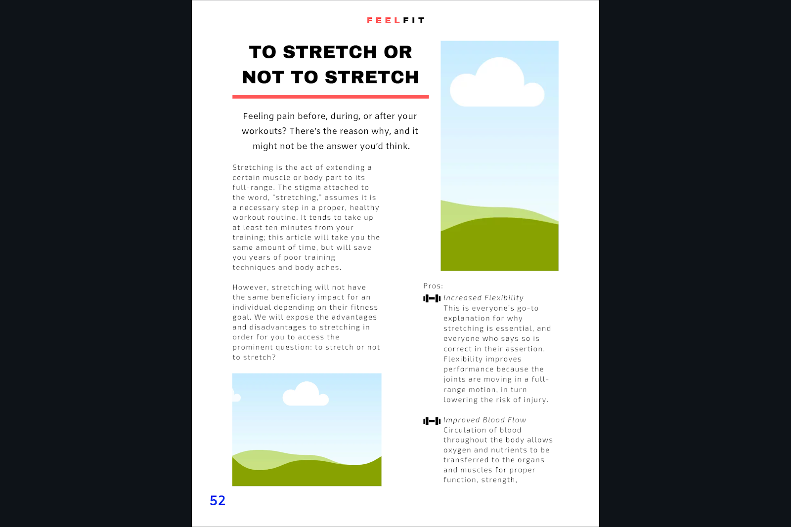
I focused my two-page spread on “To Stretch or Not to Stretch” and did it in the format of Pros VS. Cons with a conclusion at the end of it. According to the Contents page, the article begins on page 52; therefore, I have the same page number on the first page of the spread. I began with the title in large, bold font (Archivo Black) and continued with a subheading explaining what the article will focus on and to draw attention to the readers. This is in a smaller font placed strategically below the heading. Below, the article begins and is laid out in two columns with two pictures on the first page. I used the icon of a weight instead of bullet points to add character and emphasize the genre of health and fitness. Lines and cleanness is valued for the magazine, which is why each text box, image, or graphic focuses on the margin lines and symmetry all around.
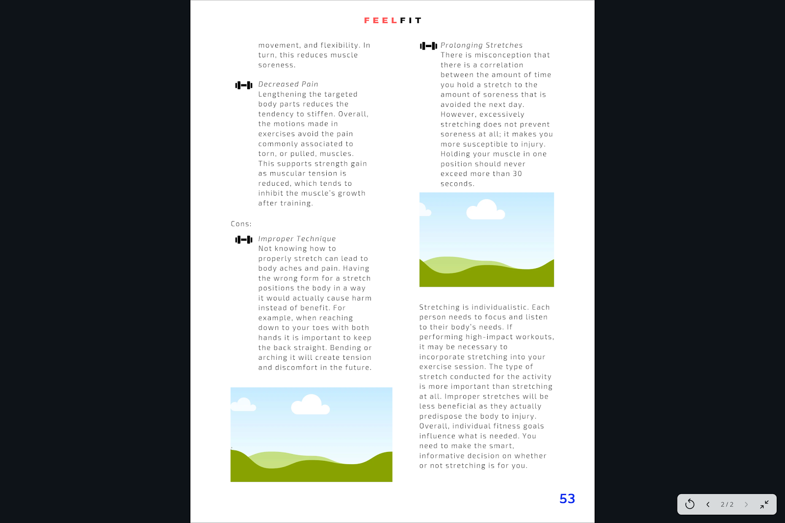
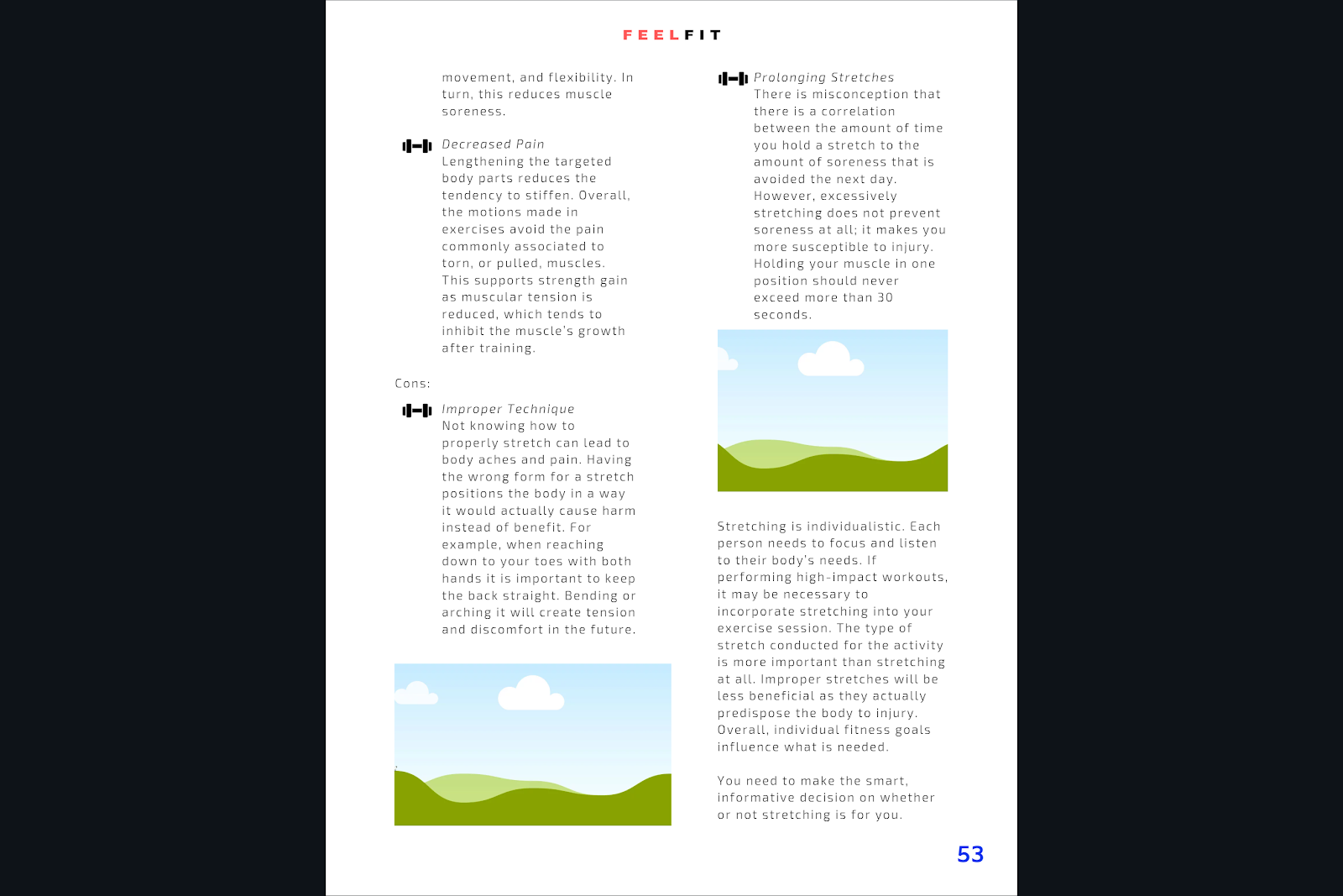
The second page of the spread continues the pros and then introduces the cons and the final concluding paragraph. I am in between changing the last paragraph and adding a space between sentences to make it two different paragraphs so it looks cleaner. This is how it would look.
Besides that, I will work on the pictures later today for the contents page and two-pager. The front cover is going to be the easiest thing to complete; therefore, I am leaving it to the end since the cover is going to be primarily the picture and a few headlines. Not too much to the point that it will be overwhelming, keeping the theme intact.
Monday, March 25, 2019
“To Stretch or Not To Stretch”: Continued Progress
“Improved Blood Flow
Circulation of blood throughout the body allows oxygen and nutrients to be transferred to the organs and muscles for proper function, strength, movement, and flexibility. In turn, this reduces muscle soreness.
Cons:
Improper Technique
Not knowing how to properly stretch can lead to body aches and pain. Having the wrong form for a stretch positions the body in a way it would actually cause harm instead of benefit. For example, when reaching down to your toes with both hands it is important to keep the back straight. Bending or arching it will create tension and discomfort in the future.
Prolonging Stretches
There is misconception that there is a correlation between the amount of time you hold a stretch to the amount of soreness that is avoided the next day. However, excessively stretching does not prevent soreness at all; it makes you more susceptible to injury. Holding your muscle in one position should never exceed more than 30 seconds.
Incorrect Stretching for Exercises
Stretching is not as simple as it appears. From ballistic, dynamic, passive, and static, the list continues on for the different types of stretching that exists. They each have their own purpose. Whereas dynamic would benefit an athlete more than a bodybuilder, static stretches better reward the latter over power-driven workouts.
Conclusion: Stretching is individualistic. Each person needs to focus and listen to their body’s needs. If performing high-impact workouts, it may be necessary to incorporate stretching into your exercise session. The type of stretch conducted for the activity is more important than stretching at all. Improper stretches will be less beneficial as they actually predispose the body to injury. Overall, individual fitness goals influence what is needed. You need to make the smart, informative decision on whether or not stretching is for you.”
Circulation of blood throughout the body allows oxygen and nutrients to be transferred to the organs and muscles for proper function, strength, movement, and flexibility. In turn, this reduces muscle soreness.
Cons:
Improper Technique
Not knowing how to properly stretch can lead to body aches and pain. Having the wrong form for a stretch positions the body in a way it would actually cause harm instead of benefit. For example, when reaching down to your toes with both hands it is important to keep the back straight. Bending or arching it will create tension and discomfort in the future.
Prolonging Stretches
There is misconception that there is a correlation between the amount of time you hold a stretch to the amount of soreness that is avoided the next day. However, excessively stretching does not prevent soreness at all; it makes you more susceptible to injury. Holding your muscle in one position should never exceed more than 30 seconds.
Incorrect Stretching for Exercises
Stretching is not as simple as it appears. From ballistic, dynamic, passive, and static, the list continues on for the different types of stretching that exists. They each have their own purpose. Whereas dynamic would benefit an athlete more than a bodybuilder, static stretches better reward the latter over power-driven workouts.
Conclusion: Stretching is individualistic. Each person needs to focus and listen to their body’s needs. If performing high-impact workouts, it may be necessary to incorporate stretching into your exercise session. The type of stretch conducted for the activity is more important than stretching at all. Improper stretches will be less beneficial as they actually predispose the body to injury. Overall, individual fitness goals influence what is needed. You need to make the smart, informative decision on whether or not stretching is for you.”
I feel as if I will need to add to the conclusion or to the article overall once I create the layout for the magazine article so I will be working on that next so I can create it and finalize it.
I also plan on getting the pictures soon for the magazine. The amount I need will be finalized once I make the layout but the concept should wil all be the same. It will involve one singular person doing the stretches or not stretching at all. This will keep the message direct, while not making the page too hectic. They will probably be placed along a white background and wear light, bright colors. The mis-en-scene will be discussed in its own blog once the pictures are created.
Saturday, March 23, 2019
"To Stretch or Not To Stretch" Progress
This is the draft to the article I am writing.
Subheading: Feeling pain before, during, or after your workouts? There’s a reason why, and it might not be the answer you’d think.
Intro: Stretching is the act of extending a certain muscle or body part to its full-range. The stigma attached to the word, “stretching,” assumes it is a necessary step in a proper, healthy workout routine. It tends to take up at least ten minutes from your training; this article will take you the same amount of time, but will save you years of poor training techniques and body aches. However, stretching will not have the same beneficiary impact for an individual depending on their fitness goal. We will expose the advantages and disadvantages to stretching in order for you to access the prominent question: to stretch or not to stretch?
Pros:
Increased Flexibility
This is everyone’s go-to explanation for why stretching is essential, and everyone who says so is correct in their assertion. Flexibility improves performance because the joints are moving in a full-range motion, in turn lowering the risk of injury.
Decreased Pain
Lengthening the targeted body parts reduces the tendency to stiffen. Overall, the motions made in exercises avoid the pain commonly associated to torn, or pulled, muscles. This supports strength gain as muscular tension is reduced, which tends to inhibit the muscle’s growth after training.
Improved Blood Flow"
I want to do three for each and a conclusion at the end explaining stretching depends on the types of stretches and each individual's fitness goals.
Friday, March 22, 2019
Changes Made to Contents Pages
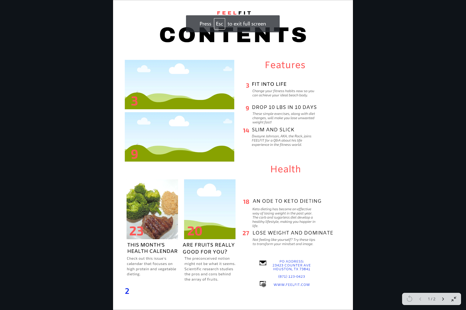
After briefly discussing my finished Contents page with another individual, I was given feedback that I was missing the page number on the individual pages. Since the pages are placed side by side, it would look better if the page numbers were placed on the left bottom corner for the first page and the right bottom corner of the second page. To contrast from the rest of the black and red color scheme, I used the same color blue #00c4cc (the code for the specific color) I had used for the information tabs. Here is the completed contents for the magazine, missing the images still.
| First page to the Contents. It is placed immediately after the Cover Page of the magazine; therefore, it will be page number 2. |
Thursday, March 21, 2019
Topic of my Two-Page Spread: Stretching
The article I decided to focus on for my two-page spread is “To Stretch or Not to Stretch.” I want to layout my article as a pros vs. cons page where the effects of stretching are introduced, such as stimulation of blood flow throughout the body, flexibility being increased, etc
I researched stretching before and after exercising and I think I want to incorporate them both and make it a collective article focusing on stretching overall. I will make a list of the two with concepts I’d like to describe below.
Stretching effecting the active body:
Pros
-Increased flexibility
-Improves performance by joints moving in full range motion
-Lowers risk of injury
-Lengthens muscles
-Reduces tendency to stiffen
-Supports strength gains
-Decreases pain
Cons
-Incorrect type of stretching before certain activity
-Static stretching may cause injury
-Prolonging stretches
-Cold muscles held in stretching positions may cause injury
-More than 30 seconds is excessive
-Doesn’t prevent soreness
Overall advice for the article:
-Stretching is individualistic
-Focus and listen to your body’s needs
-The type of stretch for activity is more important than stretching at all
-improper stretches will be less beneficial
-For power-driven workouts, dynamic over static
-individual fitness goals influence what is needed
Tuesday, March 19, 2019
Finished the Two Content Pages!
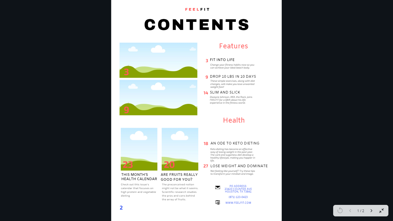
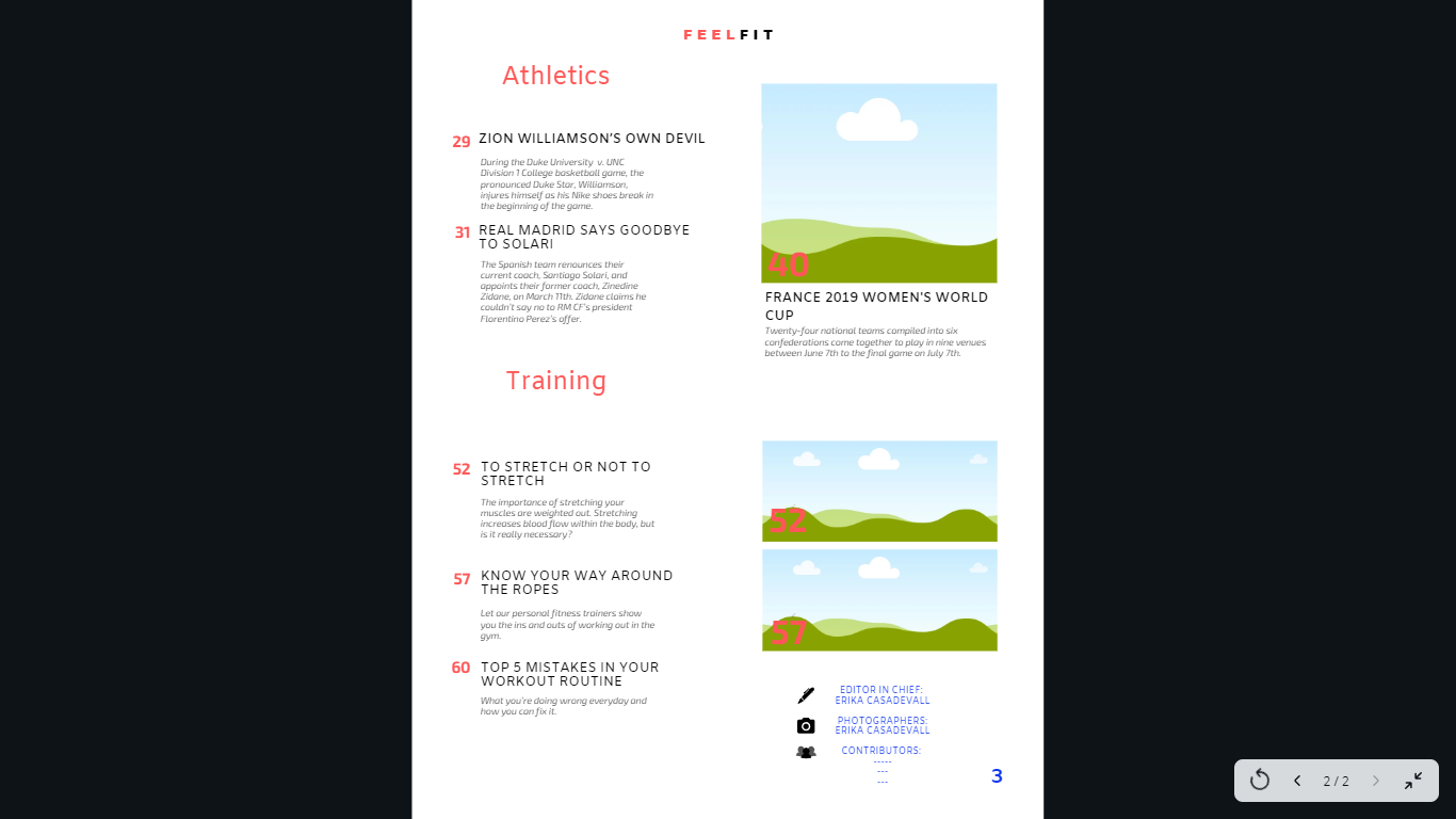
The contents page of the magazine is finished with the layout and information, such as the correct page numbers and article titles. The four different areas, features, health, athletics, and training, each have at least three articles. Each area has at least one picture. I included the location of the PO address and contact information, website URL, editor in chief, photographers, and contributors at the bottom right of the page in blue color to contrast from the red and black, while keeping the color scheme to the theme. The contributors list will be added to once the people photographed for the images are made.
Sunday, March 17, 2019
Coming Up With the Article
I have to finish creating the other layout and I will make a blog post about it. This week coming up I want to work on the article, meaning I need to decide what I can do. Since I don’t have the pictures yet, I am not limited to a certain topic of Health, Training, or Athletics. To narrow it down to three topics, it would be:
-Health: An Ode to Keto Dieting
-Training: How to Avoid Muscle Cramping
-Training: To Stretch or Not to Stretch
The last two would be the easiest to photograph images for. For example, #2 would include a demonstration of someone going through the steps of avoiding a muscle cramp. So, stretching, drinking water, taking magnesium and potassium, rolling out the muscle, etc.
The third would consist of individual stretches and their effects on the body.
-Health: An Ode to Keto Dieting
-Training: How to Avoid Muscle Cramping
-Training: To Stretch or Not to Stretch
The last two would be the easiest to photograph images for. For example, #2 would include a demonstration of someone going through the steps of avoiding a muscle cramp. So, stretching, drinking water, taking magnesium and potassium, rolling out the muscle, etc.
The third would consist of individual stretches and their effects on the body.
Thursday, March 14, 2019
Contents Page Two
I had some brief ideas of how to set up the second page of the table of contents. I am currently in the middle of designing two. One of the keeps the text all along the left side column and pictures on the right side, whereas the other one uses a combination of the two. My issue with the ladder is that the first table of contents page keeps everything nicely ordered and isn’t confusing to read through because the text is all aligned on the right side of the page. Pairing the first page with the first idea I had for the second page will keep all the text in the center focus of the magazine with the pictures surrounding it, which is the opposite of the cover page. This alludes to the magazine being open, since the contents is the first page.
I have to finish creating the other layout and I will make a blog post about it.
Tuesday, March 12, 2019
Contents: Planning Page Two
Doing the table of contents first has proved efficient for my project because it includes the most tedious dedication and meticulous decision making process in order to ensure everything fits the design.
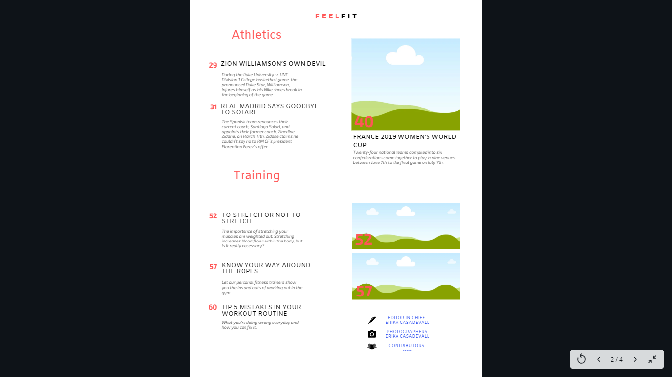
I continued brainstorming the titles for the second part of the table of contents, which will include the two sections of athletics and training. In addition, it will include the editors and contributions section that references the individuals responsible for the creation process of the magazine.
Athletics:
-Zion Williamson’s Own Devil: Nike’s
During the Duke v. UNC Division 1 College basketball game, the pronounced Duke Star, Williamson, injures himself as his Nike shoes break in the beginning of the game.
-Real Madrid Says Goodbye to Solari
The Spanish team renounces their current coach, Santiago Solari, and appoints their former coach, Zinedine Zidane, on March 11th. Zidane claims he couldn’t say no to RM CF’s president Florentino Perez’s offer.
-24 Teams Set to Compete in the France 2019 Women’s World Cup
Six confederations come together to play in 9 venues between June 7th to the final game on July 7th.
Training:
-To Stretch or Not to Stretch
The importance of stretching your muscles are weighted out. Stretching increases blood flow within the body, but is it really necessary?
-Know Your Way Around the Ropes
Let our personal fitness trainers show you the ins and outs of working out in the gym.
-How to Avoid Muscle Cramping
Follow this step-by-step process to ensure your muscles never cramp again. Feel fresh and
-Tip 5 Mistakes in Your Workout Routine
What you’re doing wrong everyday and how you can fix it.
Editors and Contributions:
-Editor: Erika Casadevall
-Photographers: Erika Casadevall
-Notable Contributions: (Those pictures in my images and places used)
I need to review magazines on my free time to see if I am missing any important information that can be included here.
What you’re doing wrong everyday and how you can fix it.
Editors and Contributions:
-Editor: Erika Casadevall
-Photographers: Erika Casadevall
-Notable Contributions: (Those pictures in my images and places used)
I need to review magazines on my free time to see if I am missing any important information that can be included here.
Monday, March 11, 2019
Contents Layout Created
I have created the first page of the contents for the magazine. This is a layout with the intended fonts and spacing I want to use. The font for the title of the magazine and contents page is Archivo Black. The font for the title of the separate sections, such as Features and Health, the article titles, and their description is Amiko. The section titles will use the same color red as in the title of the magazine to keep consistency within the product, whereas the magazine article names and description will be black and an off-black color to create a separation that is clean and appreciated by the target audience.
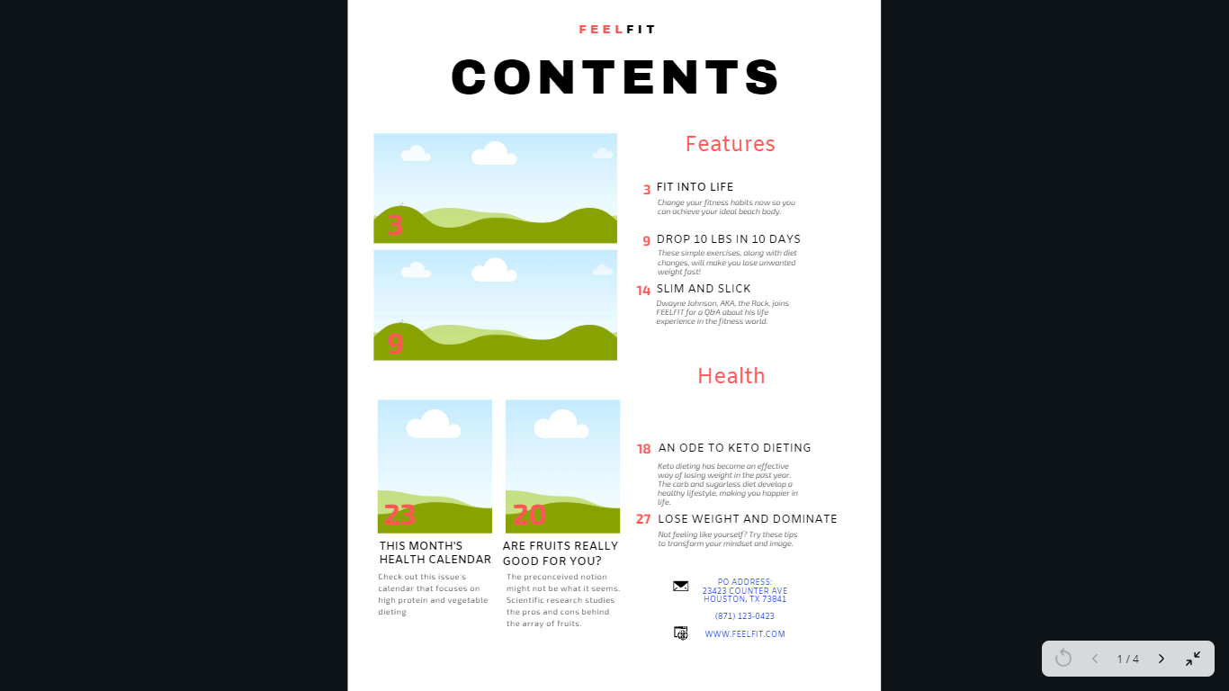
I spaced out the images on the first page to include two horizontal that will go with the top section and two vertical that go along with their own story. Everything is lined out, so I’m not completely sure about the placement of the images yet. I will try to get my peer’s opinions on Friday when we have our group discussions where I can receive feedback on my magazine.
In the bottom right corner, I include the address from where the magazine is distributed and headquartered, as well as their telephone number. Readers can use this information to reach out to the magazine. This demonstrates the magazine appreciates feedback from their readers so they are always working to be better. The website below demonstrates the magazine is available online, additional to the print version.
I spaced out the images on the first page to include two horizontal that will go with the top section and two vertical that go along with their own story. Everything is lined out, so I’m not completely sure about the placement of the images yet. I will try to get my peer’s opinions on Friday when we have our group discussions where I can receive feedback on my magazine.
In the bottom right corner, I include the address from where the magazine is distributed and headquartered, as well as their telephone number. Readers can use this information to reach out to the magazine. This demonstrates the magazine appreciates feedback from their readers so they are always working to be better. The website below demonstrates the magazine is available online, additional to the print version.
Sunday, March 10, 2019
The "FIT" Contents Idea Isn't Too Fitting
Since I have not started the photography process yet, I decided to start making my table of contents layout first without including the pictures. Initially, I had the idea of including a layout of pictures in the form of “FIT” to emphasize the message of the magazine; however, I reconsidered the outcome this would have on the magazine’s target audience.
Positives:
In order to visualize the desired layout I wanted, I used scratch paper to sketch out the designs. I compared the “FIT” images design to the straightforward one by drawing the two in theory. I thought of having a large heading with the letters spaced out more than usual, at the top center of the page that says “CONTENTS.” I want to implement the title of the magazine somewhere above or next to the large title, but I don’t want it to be too distracting. Here’s a list of ideas I had.
I am working on the rest of the layout now for the contents. Next time I blog about it, I should have an example of it on the next post.
Positives:
- Gives an artistic style to the contents
- Includes images next to the article titles in a creative fashion
- Different layout to entice readers
- Too crowded on the page
- Discourage readers from focusing on the important content on the page (article titles and their location in the magazine)
- Doesn’t follow simplistic and sophisticated design
- Looks too scrapbooky for a health and fitness magazine
In order to visualize the desired layout I wanted, I used scratch paper to sketch out the designs. I compared the “FIT” images design to the straightforward one by drawing the two in theory. I thought of having a large heading with the letters spaced out more than usual, at the top center of the page that says “CONTENTS.” I want to implement the title of the magazine somewhere above or next to the large title, but I don’t want it to be too distracting. Here’s a list of ideas I had.
- Use either a red or navy blue color and a smaller sized font placed above the title that says “FEELFIT”
- Have “FEEL” be in a red/blue, while “FIT” stays black (vice versa) above the title
- “FEEL” placed in the top left corner, “FIT” in the top right corner (CON: Disparity between the words takes away from the sophisticated design)
I am working on the rest of the layout now for the contents. Next time I blog about it, I should have an example of it on the next post.
Cover Page Headlines
For my front page of the magazine, I want to keep the color scheme consistent to the rest of the magazine. This would include black, white, red, and blue hues. The font will be the same as the table of contents and the logo that was decided in the previous blog post for the title of the magazine. FEELFIT should carry a brand along with the name that conveys determination and persistence to the target audience.
Some ideas for magazine article titles have been split into three broad topics: health, athletics, and training.
Health
- An Ode to Keto
- Lose Weight and Dominate
- Drop 10 lbs in 10 Days!
- Fit into Life
Athletics
- Zion Williamson’s Devils: Nike
- Q&A with Pro-Athlete - - -
Training
- To Stretch or Not to Stretch
- How to Avoid Muscle Cramping
- Know Your Way Around the Ropes
- Top 10 Mistakes in Your Workout Routine
With these, and more I come up, I can fill the headlines for the cover page around the main photograph. It would help to shorten the titles and have little descriptions for some.
Thursday, March 7, 2019
F E E L F I T
I started brainstorming names for the magazine in the beginning of this week and decided to focus the title on the word “fit.” During the group discussions where we each talked about our plans and developing our portfolio project, they gave me the idea of using alliteration in the title to appeal to the audience and engage their attention. By using this technique, it catches the reader’s eyes because it is the focus of the mast of the magazine. The marketing of the title is very important because it is usually the only aspect of the magazine that is visible when being sold in stores. Therefore, the stylistic choices the title is presented in is equally as important because it reveals the magazine’s intended tone it wishes to project. For example, bolder, larger font = powerful tone, whereas smaller, curly font = softer/lighter tone. Obviously the health and fitness magazines stay away from the curls because it doesn’t embody the robust display that appeals to their gym-junkies; the only curls they want are with their biceps.
This led me to the infused title of FEELFIT, because it has qualities of both health and fitness. I intend for the letters to be spaced out more than usual to develop the tough, yet sophisticated tone to appeal to the men and women in my target audience.
Sunday, March 3, 2019
Photography is an Art
I came into the weekend with a different mindset and perspective. I viewed everything through the lense of a health and fitness magazine, especially the people and objects around me.
I visited South Pointe Park in Miami Beach with my family and saw a group of friends doing yoga among each other. I was extremely impressed when a couple continued their exercise with poses with the two of them. For example, the male laid his back on the floor and used his legs to balance the woman symmetrically above him. This would be a great photo for the cover page which demonstrates both a male and a female conveying the purpose of the magazine together.
Additionally, I thought about the importance of lighting and setting for the photos in the magazine. Although some will be photoshopped to just the specific object or person in the shot because the area around them is arbitrary, others will need the setting to create tonality. If an articles focuses on the effects of weight training and I want to include an image of someone working out in a gym, the color scheme and lighting matter. Here are some colors I intend to focus on because of their meaning:
-Red: energy, passion, determination
-Blue: power, strength
-Black: sophistication, strength
-White: success, new
-Green: renewal, energy, growth
To focus the lighting in the photographs, I can use multiple flashlights to get the desired angle I want. Additionally, if i’m photographing outside and the backlighting is an issue there are some ways to overcome this.
-Use a reflecting screen, such as one used in cars to protect from the sun’s heat when it is parked
-Diffuse the sun
I need to begin taking the photos and working on the design of the magazine. I plan on doing this next week so stay tuned with an update of my progress.
Subscribe to:
Posts (Atom)